Letters · April 12
Handwritten stroke animation from Hershey-style paths; customize text, easing, and variants.
The wrong starting point
I started with a font called Bumbbled — a handwriting script that looked exactly right visually. The problem was I needed the centerline, not the filled outline. So I tried skeletonization which is an algorithm that rasterizes the letter, shrinks the stroke down pixel by pixel until you're left with a single-line skeleton, then traces it back into a path. In theory, exactly what I needed. In practice, Bumbbled's shapes were a little rough around the edges causing the skeleton to look jagged.
Hershey to the rescue
I switched to Hershey. It's a font system from the 1960s, originally designed for pen plotters. The data is already a centerline. Single-stroke paths, no fills, built for a pen to draw. The catch is; it wasn't smooth enough to match the apple-esque effect I was going for. That's where the real work started. So I had to manually adjust the curves to make them more smooth.
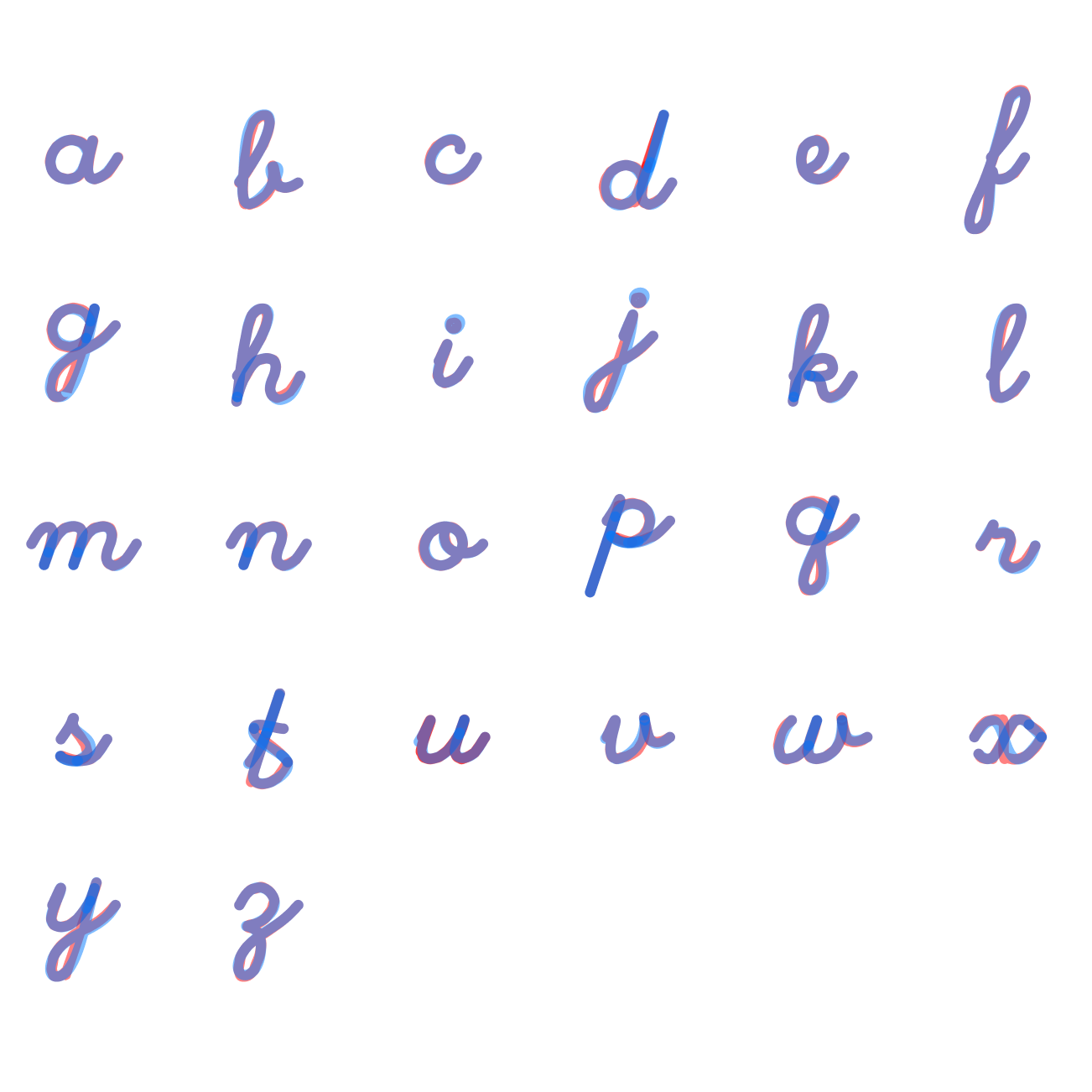
The polish loop
I built a little editor that rendered every Hershey letter side by side. Click a lettercopy ittake it into Figmapolish the Bézier curvescopy it back as an SVGpaste it into the editorsavelibrary updates.
The animation was already in the data
What made Hershey genuinely clever for this is that each letter is broken into multiple segments — the same way a hand actually draws it. That gave me a natural sequence to animate. Just drive each segment one after the other using stroke-dashoffset, and add smooth connectors between strokes so it flows smoothly.
The result
A recreated Apple-esque effect of the famous "hello" animation we're all excited to see when we unbox our new Apple products.
Have a look at the demo below and play around with the different settings.